Button Shadows: Elevate UI with Depth
In the evolving landscape of digital design, flat design has long held sway, offering clarity and speed. Yet, as interfaces become more complex, users crave tactile feedback that mimics the physical world. This is where Button Shadows emerge not just as a decorative element, but as a functional necessity. By reintroducing depth, designers can guide user attention, establish hierarchy, and create an intuitive sense of interactivity. Whether you are crafting a mobile app, a web dashboard, or a marketing landing page, understanding how to implement shadow effects effectively can transform a static layout into a dynamic experience.
The concept extends beyond simple drop shadows. It involves a nuanced approach to light, elevation, and materiality. When we talk about button shadows, we are discussing the visual language that tells a user, "This element is clickable," or "This information is important." From simple shape shadows to complex, isolated 3D realistic vector icons, the application of these techniques requires both artistic intuition and technical precision.
The Psychology of Depth in Interface Design
Human brains are wired to interpret shadows as indicators of spatial relationships. In the physical world, objects cast shadows based on their height and the position of light sources. Translating this to a two-dimensional screen creates a subconscious map for the user. A button with a subtle shadow appears to float slightly above the background, inviting interaction. Conversely, a button that appears pressed in, with inner shadows or reduced elevation, signals an active or disabled state.
For creators and marketers, this psychological cue is invaluable. It reduces cognitive load. Users do not have to guess which elements are interactive; the design communicates it instantly. This is particularly crucial for interface UI apps badges, where space is limited and clarity is paramount. A well-designed badge with a clear shadow stands out against the content, drawing the eye to notifications, status updates, or premium features without overwhelming the overall aesthetic.
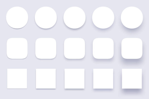
Variations in Shadow Styles and Applications
Not all shadows are created equal. The style you choose should align with your brand identity and the specific function of the interface. Here are several approaches to consider when working with button shadows:
- Simple Shape Shadows: Ideal for minimalist designs, these shadows use soft blurs and low opacity to create a gentle lift. They are perfect for primary call-to-action buttons where you want emphasis without aggression.
- Clear Buttons Badges: These utilize transparency and crisp edges combined with subtle shadows to create a glass-morphism effect. This style is trending in modern OS designs and works well for overlay elements that need to feel lightweight yet distinct.
- Miscellaneous Shapes Material Shadows: For non-standard buttons—such as floating action buttons (FABs) or irregular icon containers—material design principles suggest larger, softer shadows to indicate higher elevation. This helps distinguish these unique shapes from standard rectangular content blocks.
- Isolated 3D Realistic Vector Icons: When realism is the goal, shadows must be precise. This involves calculating light direction and intensity to create a convincing three-dimensional illusion. These are often used in gaming interfaces or high-fidelity prototypes where immersion is key.
Each of these styles serves a different purpose. A financial app might prefer the stability and trust conveyed by solid, material shadows, while a creative portfolio site might opt for the ethereal quality of clear badges. The key is consistency. Mixing too many shadow styles can confuse the user and dilute the visual hierarchy.
Practical Implementation for Designers and Developers
Implementing these concepts requires the right tools and workflows. For many professionals, starting with high-quality assets saves time and ensures precision. Consider a product file that includes a comprehensive set of resources. Typically, this might include one vector EPS10 file and one JPEG 72ppi as a preview. The vector format is crucial because it allows for infinite scalability without loss of quality, ensuring your buttons look crisp on everything from smartwatches to 4K monitors.
If you want to separate elements, remove, or edit something, please use a vector editor such as Adobe Illustrator. This flexibility is essential for customization. You might need to adjust the color of a shadow to match a dark mode theme, or change the angle of the light source to align with other elements on the page. Having access to editable vectors empowers you to tailor the assets to your specific project needs rather than being locked into a rigid preset.
For developers, translating these visual designs into code requires an understanding of CSS box-shadow properties or native mobile development frameworks. The goal is to replicate the softness and spread defined in the design tool. Performance is also a consideration; overly complex shadow effects can sometimes impact rendering speed on lower-end devices. Therefore, optimizing your assets and using efficient coding practices is part of the professional workflow.
Adapting Button Shadows for Different Audiences
Different users interact with interfaces in different ways. Educators creating e-learning platforms need high contrast and clear indicators to help students navigate courses effortlessly. Here, bold button shadows can reduce ambiguity. Freelancers building personal brands might use subtle, sophisticated shadows to convey elegance and attention to detail. Small business owners launching e-commerce sites need buttons that drive conversions; in this context, shadows can be used to make "Add to Cart" buttons pop against product images.
Accessibility is another critical factor. While shadows add depth, they must not compromise readability. Ensure that the contrast between the button text and the background remains high, regardless of the shadow effect. For users with visual impairments, relying solely on shadow for interactivity cues is insufficient. Always pair shadow effects with other indicators, such as color changes, borders, or text labels.
Maintaining Consistency and Originality
As you integrate button shadows into your projects, maintaining a consistent design system is vital. Define a standard elevation scale. For example, level 1 might be for cards, level 2 for buttons, and level 3 for modals. Stick to these rules across your application to create a cohesive experience. This organization helps teams collaborate more effectively, as everyone understands the visual language being used.
However, consistency does not mean stagnation. Use miscellaneous shapes and creative badge designs to inject personality into your interface. An app surface button doesn't have to be a rectangle. Experiment with rounded corners, pills, or circular icons, provided the shadow logic remains consistent. This balance between structure and creativity keeps the interface engaging without sacrificing usability.
Ultimately, button shadows are more than just a trend; they are a fundamental tool in the designer's toolkit. They bridge the gap between the digital and physical worlds, making interfaces more intuitive and enjoyable. By leveraging high-quality vector assets, understanding the psychology of depth, and applying these techniques with precision, you can create digital experiences that resonate with users. Whether you are editing an EPS10 file in Illustrator or coding CSS for a web app, remember that every shadow you cast serves a purpose: to guide, to inform, and to delight.
Embrace the depth. Let your designs rise above the flat surface, and watch as user engagement follows. The right shadow, applied with intent, can turn a good interface into a great one.